Wednesday 12 June 2013


Block 1: 12 June.


UNION CASTLE BUILDING No.1 (below)

My next task on the Union Castle Building was to indicate the new areas where the owners on the Building want to Lower the existing Finished Floor Level ( FFL ) to its Original FFL. Over the Years the existing FFL of the Union Castle Building was raised. The FFL is 950mm above the outside street level. The Tenants that currently have these FFL levels are ABSA and the Book Store.

If one looks at the Footprint plan of the Union Castle Building one will see that the building has now been divided up into five Tenants opposed to the previous four.

ABSA: indicated on the plan in an orange band will be unchanged at this point. There for I have hatched ABSA in a dark grey that looks black on the smaller image. This lessens the chances of confusion later on in terms of what is being demolished and changed to those staying the same.

EXPLORATORIUM: indicated on the plan in a green band is also to remain unchanged and has been hatched slimily to ABSA.

NEDBANK: Indicated on the plan by the blue band is to be extended. If you look at the plan you can see the internal walls such as brick and dry all are all indicated to be demolished. Nedbank has a FFL of 380mm making the difference in floor levels from ABSA to Nedbank 570mm. Now because Nedbank is extending into the old Book Store the existing FFL of the book store needs to be demolished to match that of the existing Nedbank making a constant FFL throughout Nedbank. The area to be FFL to be demolished is indicated by a light grey angled hatch. There is also a new Fire escape door that has been added to comply with the new fire regulations.

RETAIL STORE: looking at the plan you can find there is now a smaller section of the plan that is also having its FFL demolished and lowered on the top left. This is going too changed into a Retail Store. The reason for lowering this FFL is because currently this space is the Book Store and the outside ground level is at 100m, the internal FFL is at 950mm making the change in levels to great. Also the current owners of the building want the building to be wheel chair friendly so no stairs to be allowed.

The remaining parts of the Book Store will now become the new Standard Bank. Standard Bank will be keeping g the existing FFL of 950mm.


UNION CASTLE BUILDING No.2 (below)

Once the owners where happy with all the changes to the different tenants, the footprint of each tenant was send out to the corresponding banks so they could start their floor plans.
Once I had received the plans for each tenant I could make the last small changes to each tenant’s footprint before sending the plans to council.
TENANT 3: Nedbank had three small changes these where; moving the newly proposed fire escape door to the far left hand side to make it easier/faster for the workers to evacuated the building if a fire was to accrue. The total floor area was extending for Nedbank by demolishing the far left side wall that was to be a part of the new retail store. This gave Nedbank the space for the fire escape door and the large existing window. The last change was the adding in of the disabled toilet and regular toilet on the far left wall.
TENANT 4: The only changes to the Retail store was the proposal of replacing in of the previously existing single door that was blocked up when the FFL was raised to 950mm, indicated on the top elevation and the newly proposed disabled toilet on the far right wall.
TENANT 5: Standard Bank changed their stair case on the far left side to save space and to make the stair case into a fire escape exit, now also changing the far left hand side door into a fire escape door to comply with fire regulation. A proposal for a disabled toilet to be built in the top right hand side corner was asked by Standard Bank.
These where the only amendments to be done to the footprint of the Union Castle Building and once meeting with the civil engineer we concluded where four pilot holes had to be dug. These pilot holes are to be used to indicate specify certain aspects of the building. Two of the four pilot holes are to identify the thickness of the existing screed, this it to make sure that the existing creed can handle the new two ton ATM machines that will be placed in certain areas. The last two pilot holes are to see the depth of the existing foundation as if the foundation needs to be extended deeper.  


CS

Tuesday 11 June 2013

Block 2: 11 June.


UNION CASTLE BUILDING No.1 (below)
 The latest project I have been asked to work on is the Union Castle Building located in the V&A Waterfront.
The Building has currently has four Tenants. Two of these Tenants are Banks. One is a Book store while the last of the tenants is the Exploratorium, located at the second floor of the building.
My task was to go to Union Castle Building and measure up the entire ground floor, as no drawings of the internal existing layout existed. Measuring up and plotting out the current floor plan of the building took two full days. Once all the dimensions where taken down, I had to draw up the building from scratch, starting with the grid or columns of the building as this gave me a starting point to now draw the internal layout of the existing building.
Green: All the areas that have a green line around them indicate common areas used by the public. The Exploratorium is also seen as a common area.
Orange: Indicates ABSA located on the bottom East side of the building.
Purple: Indicates the total floor area of the book store located on the West side of the building. The book store has the largest floor area out of the four Tenants. There is also a locked room that is inaccessible due to lost keys; this is indicated by the orange hatch area on the plan.
Blue: Indicated NEDBANK. NEDBANK is the smallest of all the tenants located on the North East side of the building.
Once the plan was drawn up I was asked to do multiple sections through the building to show parts of the building that aren’t easily identifiable by look at the existing plan.
The section are A, B, C, D and E.


UCB ELEVATIONS No.1 (below)

The elevation where next to be drawn, The V&A Waterfront where very pleased with the detailed elevation I had done. The Union Castle Building is over 60 years old and falls in to the Cape Town heritage department so any alteration will have to be accepted by them.


Block 1: 11 June

FRONT ENTRANCE No.1 (below)
This was a very simple task of extending the existing roof of the front entrance of the Blue Waters Project to cover the car entrance.
In this drawing shown you can see the photos showing the existing building and how the roof cover only extends to the start of the road by the car entrance.
Given this extension will allow for better security and for a more pleasing/ welcoming greeting.


POWER, WATER SUPPLY No.1 (below)
Here again we come back to the Site.
 I was asked to indicate the areas and positions of the new Water, Electricity and TV cables.
Blue: indicating the water supply that starts from the front entrance and travels along the road to three new points. Two of the water supplies lead to the Cavan Camp site. While the third branches off to the right to the new proposed pool area.
Red: Indicates the Electricity that starts from the front entrance as well, travailing along the road to the same indicated spots as the water points. This will give all the Caravans power to their caravans for light and cooking requirements. The red supply that branches off to the right is supply power to the pool pump.
Green: Indicates the TV cables that will supply all Cabins and Chalets with DSTV and other channels, this however does not include the camp site area.


 CS

Thursday 23 May 2013

Block 3: 23 May

STAFF FACILITY No.1 (below)

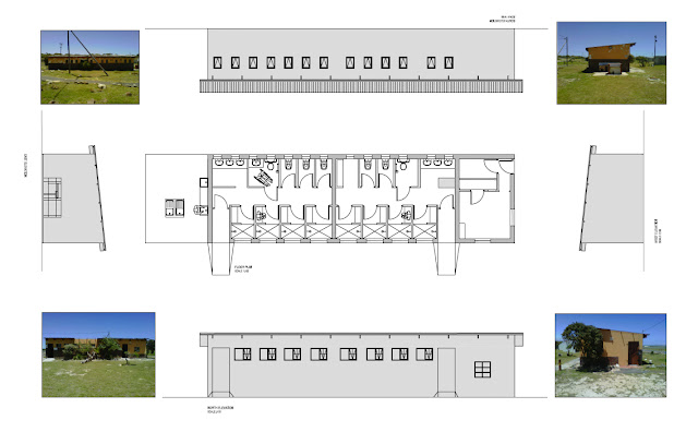
This Ablution block is going to be converted into new staff facilities.
As you can see it is a similar design currently of the existing ablution block No.1. The only difference is that his ablution block has a covered washing up area.

All the internal parts will be demolished and the new proposed design will be built in its place.
The Ablution currently just consists of four showers and three toilets, including a disabled toilet in both the male and female section.


STAFF FACILITY No.1.1 (below)

Here you can see the completely newly designed Staff Facility. We have shown to demolish the entire internal components and have made a small watch guard room on the far left.

The guard room will consist of a large spanning glass, so that security can be at its best when the guard is seated at his post. He has a small kitchenette to make food and a toilet so he doesn’t have to leave his post for large amounts of time.

There has been two storage room s built into the centre of the design to allow appliances to be kept in safe keeping.

The main areas where the staff will be located during breaks are in the middle of the design seen in the floor plan and which moves down to the right. As the staffs enter the facility they walk into a common room with couches and TV and just behind a large eating table.
Passing through the door way the staff will come to the kitchen with built in cupboards.
The male and female changing rooms are on opposite sides of the staff facility. The changing room consists of a shower and a disabled toilet

The outside has an extended patio area, which will be paved with a extending cover for shade. The paving runs around the whole left hand side to allow the guard on duty to walk around easier when on inspection checks.

Looking at the facade of the staff facility we have kept the same look flowing from the existing Cabins and Ablution blocks into the facade design of the staff facility.

We have also added in skylights to allow better lighting into the building, saving on electricity.


STAFF FACILITY No.1.2 (below)

In the revision of the Staff facility we have changed the design of the guard’s window to a more common design as well as change the entire entrance design.
We have shifted and narrowed the patio area, placing in new windows and replacing of the sliding doors. All windows on the sides by the change rooms have been lowered as well and the facade design using the bricks and plaster has been altered to make for a more esthetically pleasing presentation. The windows in the disabled toilets have also been hanged and lowered.

All revisions are indicated by the revision cloud.


CS


Block 2: 23 May

ABLUTION BLOCK No1 (below)

Here I have shown you all the current state of the main Ablution block No.1.
Looking at the pictures one can see the state of the Ablutions is very poor.
The floor plan as we see consists of four showers and three toilets, including one disabled toilet.


ABLUTION BLOCK No1.1 (below)

The only amendments that has been done to the revised Ablution block No.1 was the demolishing of the showers to allow for the disabled shower. The other change design to this Ablution block is the size of the washing up table on the far left side. This small narrower table will allow for more people to wash up easier and let the flow of traffic move better.


ABLUTION BLOCK No1.2 (below)

We met up with the lands architect who working on this project is asked if we could change the front facade of the Ablution block No.1. So we have extended the patio and placed the washing up area outside for people who want to do dishes.
This allows for the people washing up watching their children play outside while the new inside washing up area is used only for washing clothes.


We have included in the newly designed patio a flower garden; this will stop people trying to look into the shower or toilet area.


Here we are able to see how the design of the Ablutions block will look from all sides. All the newly changes in the design are indicated by the revision cloud.

CS


Block 1: 23 May
Hi all,

I apologise for the late Blogs. I have been extremely busy at work, Now that I am also working for a Medical Supply Co.
Now I will get everyone up to date on the work I have done as well as the new projects I am currently working on.

ABLUTIONS BLOCK N02 (below)

Just to give everyone a better understanding of what it is I am working within terms of this Blue Waters Project.
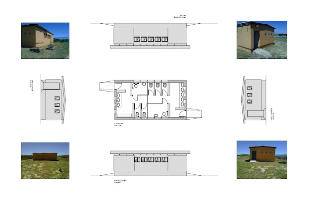
This is the existing Ablutions block No.2
As you can all see it is very basic with just the basic needs of the people.

The overall presentation of this Ablution block is very poor and in a great need of a complete remodel.
The paint has been sun beaten and is starting to peel off.


ABLUTION BLOCK No2.1 (below)
Here is the latest and revision of the Ablution block.
As you can see there have been changer to the showers at now we have catered for a disabled shower unit. This change in design has been amended to both the male and female ablutions.
An extra hand basin has also been added to the male’s ablutions now allowing for four men to wash their hands at the same time.
 

CS

Tuesday 12 March 2013

Block 1: 12 March


Today I finished my second Ablution block for my Blue waters project.

The only changes today on the design was the entrance to the male and female toilets, I have the PDF files and will upload them at the end for everyone to see.

The roof how ever did changed but only by adding in and removing of three batters. I also add in new louvers to the design to give the people using the ablutions some more privacy when they are showering and on the toilet.


 ABLUTIONS BLOCK No.2 (below)

This is what the was my first go at the ablutions block.
As you can see the plan and elevations are very basic with no annotations as of yet.
Pay attention to the entrance play out as this was one of the main thing to be changed in design to make it easier to for people to be directed to the showers or toilets.


ABLUTIONS BLOCK No.2.1 (below)

Here is the final design of the No.2 ablution block, As you can see the main entrance to the male and female toilets has been altered and shows the people a better way of finding the showers and toilets. In the drawing you will have noticed that i have placed in the new louvers.


SITE PLAN. (below)

This is the site plan to witch my designs are to be built.


MAIN ALBUTIONS BLOCK. (below)

This is the main Ablutions block as you can see it is much bigger and have more facilities for the people to use.
The main ablutions also have louvers and new added in showers with a fully newly designed floor space, making it easier for disabled people to get around inside.

Full annotations have been given with dimensions and human figures to make the plan and elevations easier to read.

This drawing was completed last week Friday and is still be changed now and again as the design will change at least 40% from the first design.


CS

Monday 11 March 2013

Block 1: 11 march 2013

To day I stared with the new Blue Water ablutions block design.
The design is very similar to the first ablutions block I had to draw up.
The building is a run down existing ablutions.
I have drawing up the building from scratch and drawin on the new proposed design for the ablutions.

The ablutions must cater for a caravan camp site.
The current ablutions currently have a male and female side each with toilets, and paraplegic toilets and basins.
-The male toilets have two toilets and one paraplegic toilets, one long urinal and three basins to wash hands.

-The female toilets have three toilets and one paraplegic toilet with five basins.

I have extended the original building to now make space for showers and new toilets and basins for each male and female toilet.

It is amazing how much a design will change in the drawing process, going from the placing in of new toilets or the removal of a window that was just placed.

I will post pictures of the design later this week as a pdf file so everyone can see how the original ablutions looked and how they have changed with the new proposal.

CS